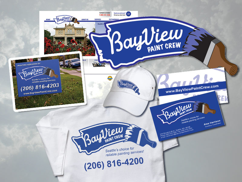
This Seattle, WA client requested a complete re-branding of their company. The painting company wanted to attact new consumer-based customers in the Seattle area and wanted a fresh, friendly approach. I used a bright blue theme with relaxed lines to create a sense of friendliness and freshness in the brand and create trust. One feature that I liked about this logo is how the paint brush stroke mimics the Western coast of Washington state and how the name comes right out of the Seattle area.
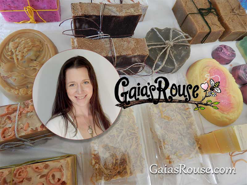
Lindsey's a friend of mine who requested some help drawing a logo for her that would be featured on some of her home-made products. The logo is hand-drawn with a bold black, a color she wanted to be striking on signs and labels. The delicate branch with a small bee is reminiscent of the beeswax her products are made of. She also raises the bees!
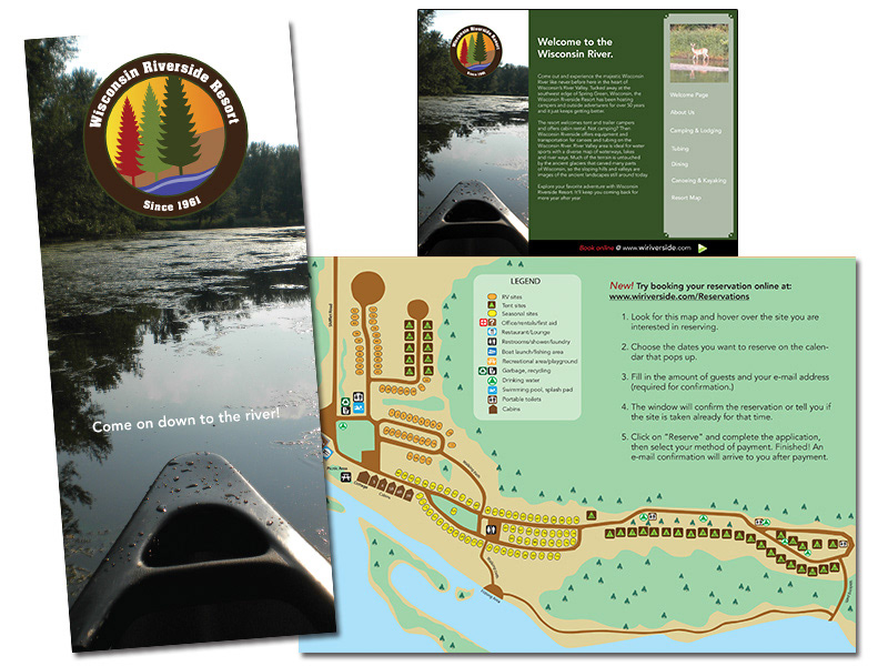
This client asked to have their resort brochure re-designed and updated. The brochure folds out to a map. And interactive PDF accompanied the package.
